Posts

Less is More AND Addicted to CAS

Image
Woo hoo!  I have returned home from a wonderful holiday with our daughter and her family at Peregian Beach on the Sunshine Coast in Qld, and am delighted to discover that the challenge I want to enter at Less is More also coincides with challenge #35 at Addicted to CAS.  LIM is having a Lucky Dip week, and the theme is 'Round and Round', whilst the ATCAS theme is 'Wheels'. My lovely daughter brought with her some gorgeous stamps to feed my addiction (and for my recent birthday) and so I chose one of those (by Hampton Art)  for my card this week. I minimally coloured it with Distress Markers, but added a spot of Glossy Accents to the balloon.  A day later, I added the hand-drawn border, using a die as a template.  I'm so grateful for receiving such a beautiful stamp, which lends itself so well to the CAS style I'm still trying to come to grips with.
Scrapbook Boutique March challenge

Image
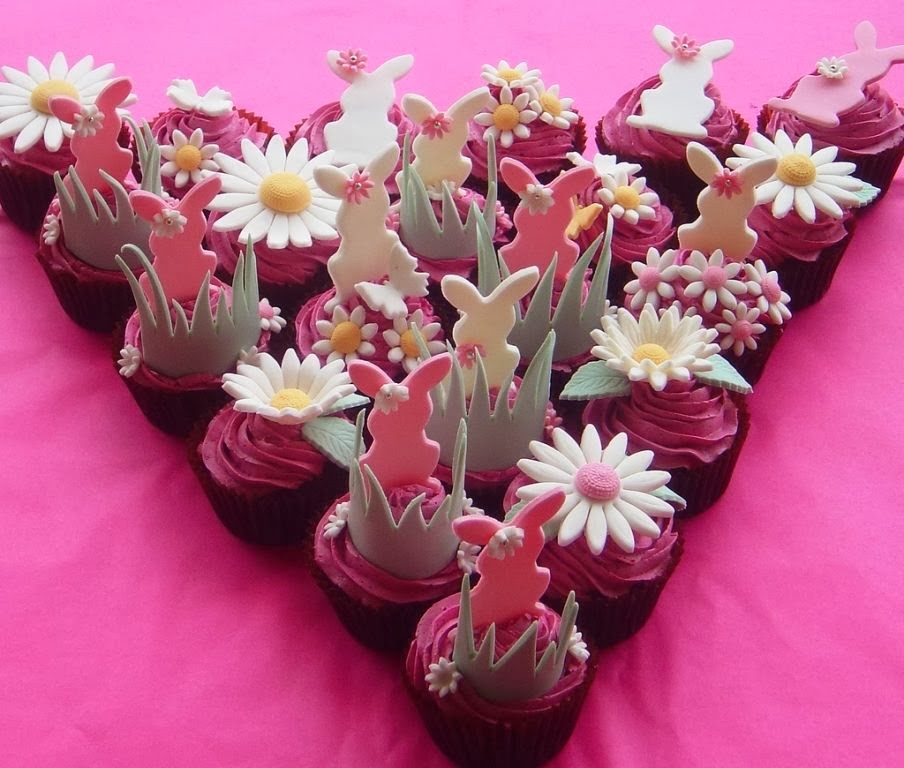
This month's  Scrapbook Boutique blog challenge  is this beautiful photo inspiration - it can either inspire your project, or the entry can be themed to Easter.  I just love these colours, so took my inspiration from those, the angular shape, and the flowers. Rather than adhere strictly to the triangle shape, I have attempted a 'skewed' layout for the first time for this card, and am pleased with how it suggests the original shape, although not copying it.  For my main flower, I used a Heartfelt Creations vintage floret, stamped onto dp, then cut out and assembled, with the bright yellow centre for interest.  Of course I had to add those fresh white daisies, and grey leaves, as per the photo.  The rest is a lot of pink, but I just love it!

Retro

Image
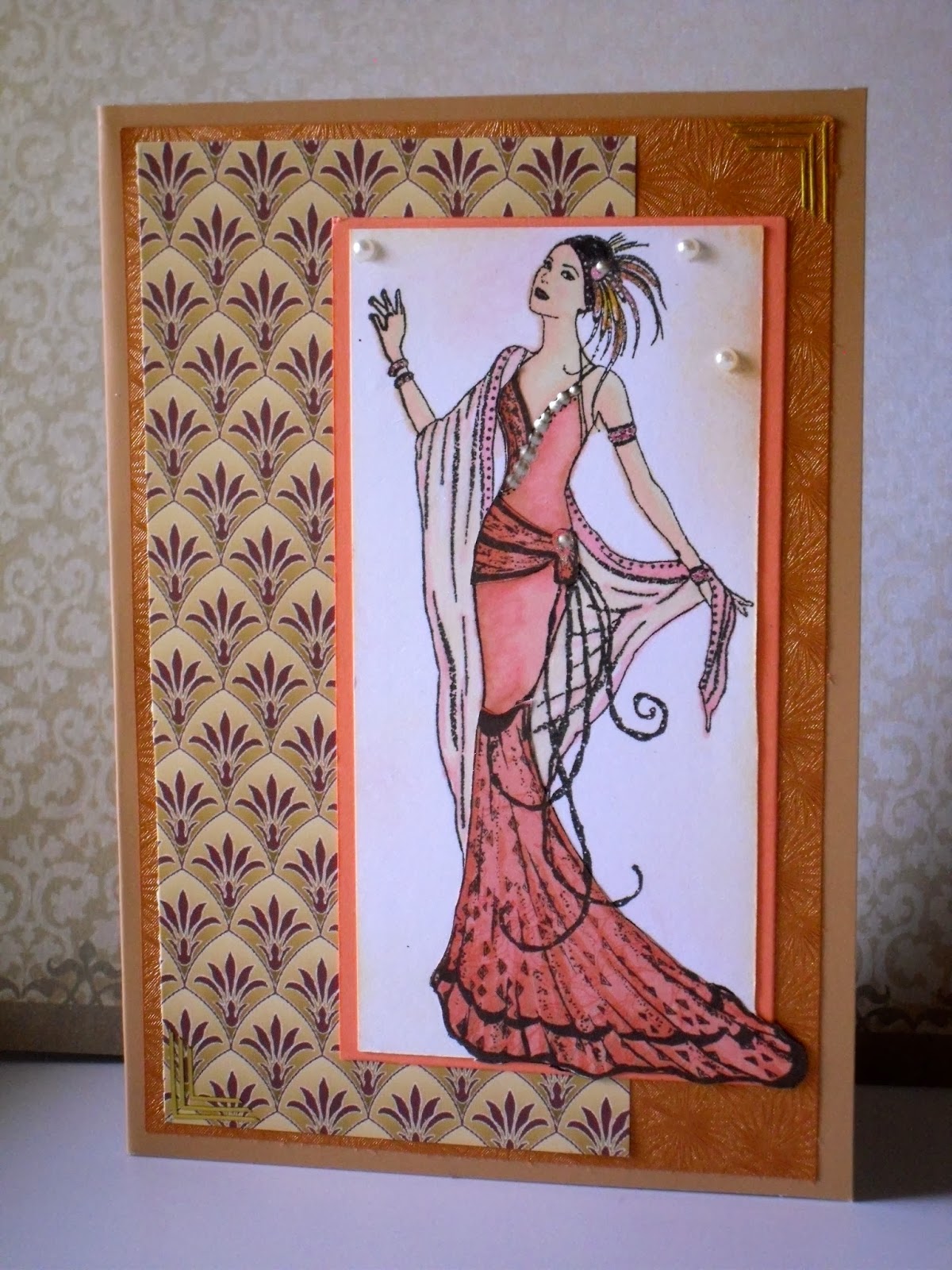
Retro is the challenge at the Outlawz this week, and at first I thought my card is not CAS enough, but I have checked back with their guidelines, and feel that it can be called CAS (clean and simple) because of the open space (pattern paper) and the focus on the image without distraction.  I hope I have interpreted this correctly, because of course there is no 'white' space, but I'll enter and let the adjudicator decide! My card features a beautiful art deco lady, designed by Claire Coxon.  It's very 'Gatsby' so well qualifies for the Retro tag - but further back in time!  I have partly paper-pieced her (the skirt, hip band and bodice) but have coloured the rest with Copics.  I sponged the white background a little, and then mounted her on beautiful art deco paper.  She is so elegant!  What do you think?

Spring flowers

Image
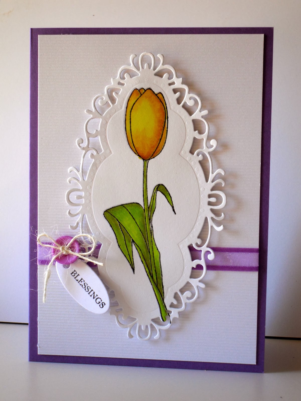
Hi there!  This week the challenge at Less is More is calling for Spring flowers.  I can totally understand how desperate for Spring those in the northern hemisphere must be after the severe winter weather they have experienced almost everywhere.  Of course, here in Australia we are in Autumn, rather dry and brown in our gardens (we have been trained to conserve water) but the weather is glorious for the most part - sunny, dry, clear blue skies.  But I do love spring flowers, especially tulips, with their gloriously waxy petals, so I have chosen that flower for my entry.  Meanwhile, over at Annabelle Stamps , the challenge is a colour one - lime green, yellow, and a shade of purple/eggplant. The image, coloured with Copics, is from ABS set 'Easter Hope', and the sentiment is also ABS - from the set Branch Out.  The oval frame is a Creatables by Marianne Design.  Hope you like it and for those in colder climates, hopefully Spring is truly just aroun...

Green and Yellow

Image
This week's challenge at Less is More is a colour challenge - and the colours are Yellow and Green.  Is it just a coincidence that Chrissie happens to be in Australia at this time, because these colours (or more accurately green and gold) are Australia's national colours!  I only wish I could have created a card with a nationalistic theme, but nothing in my collection of stamps seemed remotely possible to use in that way - though as often happens, once my creation has been submitted, I think of or find another stamp which would have been much, much better than the one I chose!  However, here is my cute bird by TAWS, along with its sentiment - very, very CAS for me!  I hope you like it and I also hope Chrissie is enjoying her visit to Australia and is being made to feel very welcome.

Simon Says Stamp blog

Image
On the last Wednesday of the month, SSS blog is hosting a 'Work It Wednesday' spot, open to all,  to show what we have been working on.  This month, following SSS new releases, we are to use a SSS product.  I have a card here that I made this week for the current Muse challenge, but I was a little too late to meet their deadline.  It uses the SSS set called Thinking of You.  I really like the mix of fonts, and so many elements in the set which can be used in countless ways.  The simple line of circles is used to create a rainbow pattern, but it also includes solid and outline flowers, an arrow (so on trend) and leaves and stems.  I love my new stamp set!

Less is More #160

Image
The recipe for this week's challenge at LIM  is to use something made from metal.  What luck then, that when I was shopping at the Papercraft Show over the weekend, I picked up a couple of small metal doily shapes and voila!  here is my entry: I have chosen a strong colour combination, as I felt it was needed to complement the metal, and have used textured gold paper and aqua cardstock.  The flower was cut from a Memory Box die - Tilda swirl, and the metal shape sits beautifully as its centre.  I used a MFT die for the chevron border, and enamel dots by Studio Calico.  The perfectly simple sentiment is by Simon Says.