Posts

Showing posts from March, 2013

Think Spring

Image
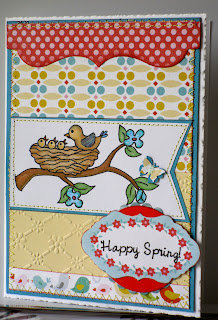
The Sweet n' Sassy Digi Challenge this week is to Think Spring!  I know that my daughter in Wisconsin is fervently praying for some Spring weather, so on her behalf, I have thought back several months to our own spring season (when, ironically, I was in the US visiting said daughter and family).  Spring is a wonderful season, full of new life, expectation and promise.  In the Northern Hemisphere, it also coincides with Easter, so a powerful spiritual message is embedded in Spring.  For my card this week I have chosen a sweet digi image from SNS called Birdie Blessings - can't you just hear the clamouring chirping of the baby birds, and feel the constant demands their incessant hunger places on the parents?  Buds, butterflies and birds are just part of Spring  - let us see what you think of when you think of Spring by joining in the challenge this week!

Aqua, wisteria, artichoke and lime

Image
This week at Colourq challenge, those delicious colours plus white are to be used.  Here is the inspiration for this challenge:  Aren't those colours just gorgeous? For my card, I used a technique demonstrated by Darlene which you can check out HERE  , where she used a mask to create an interesting shape to colour with sponging, and then overstamped the focal image.  The effect is simple and very pleasing, and I hope I have done her tutorial justice here.  I have used a stamp set by Annabelle Stamps called Stemmed Flowers for the main image and the sentiment is from another Annabelle Stamp set called Acacia, but I did not ink the word 'kindly' as I wanted a more CAS style.  I have used 3 shades of Distress Inks for the background giving the colours aqua, pale wisteria and lime.  I have tried to reproduce the other specified colours with my own stamp pads, using Stazon Olive Green in place of Always Artichoke and Memento Grape Jelly for the da...

CAS challenges

Image
Each weekend I eagerly check in with my favourite CAS sites, Less is More and Addicted to CAS, to see if I can enter their challenges.  This week I have tried to combine Less is More  Week 112, which is to use Beads, and ATCAS  week #9 challenge which is Spring.  I have a lovely new stamp set from Annabelle Stamps called Stemmed Flowers, which I definitely wanted to use for Spring, but the beads - arghh!  I decided to keep the beads just for the flowers, and put giant ones in the centres, in place of the buttons I would normally use.  I think they quite suit the flowers now, and adhered them securely with red line tape, after I pierced the centre of the flower to allow for the prominent point of the bead to go through to the back of the panel.  I resisted using beads on the butterfly, as it would have been too heavy a look.

One year old birthday card

Image
I had been asked by a friend to make two birthday cards, with both being for little girls - what fun I will have!  I have completed the first card for Eveie - yes, that is the way the parents spell her name, so we can't argue with that!  Is a baby's card for the child or the parents, I wonder?  Probably both, but I did want to try to make something of interest for a little one, so this was my thought process in achieving that.  Knowing how much one of our grand-daughters in particular loves dogs (would love to have a dog, really) I thought a puppy might make an interesting focus for a one-year old.  The card would need texture, which I added in the glitter balloons and the number one, and pattern, and perhaps something 'funny' (the balloons tied to the puppy's tail) so with all that in this card, plus a speech bubble including her name, here is my card for Eveie.  I hope she likes it.

Butterflies

Image
I saw a beautiful card by Kylie from the Addicted to CAS challenge design team a few weeks ago, and have tried to emulate the idea from memory - as I have said before, I don't like to copy from an example in front of me, but try to remember and interpret in my own way.  The card I saw had butterflies flying off the card, so from memory here is my attempt.  I used a shimmer card, and stamped the butterflies with distress inks, so the look is very muted.  Also, it is difficult to stamp a sentiment on shimmer card, so I would not use it this way again.  The butterflies are by Sweet n' Sassy - stamp set and dies to match - awesome! Kylie's blog tutorial can be found HERE   - check it out if you are looking here and see how the experts do it!

A Masculine Card

Image
The Sweet n' Sassy Digi Challenge this week is to create a masculine card - not so easy perhaps for some of us, but hopefully there will be plenty of inspiration from the design team this week.  I live by the sea, and so the digi image of the Lighthouse really appealed to me.  This digi stamp was really easy to colour with Copics, with the shading already obvious in the image.  I like the symbolism of guidance and security associated with a lighthouse which makes this a perfect masculine card for the older men in your life.  To create this card, I covered the card front in a canvas-like designer paper from my stash and chose a masculine herringbone pattern for the bottom mount, and all shapes were mounted on dark brown cardstock.  A few flags, and a brown button and twine completed this card.  I hope you like it, and please send in your own creations for us to see, as we all learn from each other!

Two for Tea

Image
I have been asked to make a special card for the loved grand-daughter of a friend, who will be starting a new job shortly at a store specialising in tea blends.  If possible, I was to include a red teapot and cup - so off I went to the internet for a digi stamp!  I found just what I wanted at the birdscards  and a matching cup too. I hope I have done the lovely image justice with my card.  And good luck with the new job too!  Tea always tastes better in a pretty cup, don't you think?

A Masculine Card - marathon effort

Image
I have spent most of this day making the card I have to show you below.  I first saw the original in a pinterest site, but after making my own version with printed, coordinating paper, I searched for the author of the deconstructed chevrons, and found it was JJBolton . I should have looked first, but because I'm not a good 'copier' ie. if I see something I like, then I feel inhibited to change it, whereas if I remember an idea, I can do my own thing, and it will be quite different - usually not so good of course!  JJBolton's is the most amazing card, so please check hers out if you haven't come across her before - she just excels in CAS cards of the most exquisite kind. Perhaps I shouldn't be showing you this card, then, but hey, we all have to try our hand at new things, and they won't always be perfect - lol!  I had a most trying time with this card, as I really wanted it to be special for my son-in-law, and in truth, I am proud of it, but it did take an...

Frame It

Image
The challenge for week number 111 at Less is More , is to frame it!  The frame can be a die cut, doodle, whatever.  I played around for quite a while with my many dies, which is sometimes more difficult than having only a few items to consider, but eventually, I discarded that plan, and seized upon some re-cycled black card which had regular apertures already cut out.  I think it was originally packing for my husband's coffee pods!  This gave me the idea to frame something, as one would in a gallery, and so my card was created!  Well, OK this gallery is somewhat rustic, with the pictures hung from a tree branch, but I like the result!  Hope you do too!

A Change in the Weather

Image
At last our record hot spell for March has ended, and with cooler weather, it is so enjoyable to create in my craft room.  My first card to share today is a wonderful stamp by Stampendous, which I was able to pick up at Michael's when I was in the US last year (I might add, one of many things I picked up at Michael's - we don't have anything to compare here - for prices, I mean).  It is heat embossed with clear embossing powder over black pigment ink, and acetate wings and body are treated similarly and adhered to the body.  A simple but very elegant card. My second card uses a Memory Box die called Hollyhock stem, and it was fun to use these die cuts instead of stamping an image in the oval frame.  The ribbon scallop is another die, this one from MFT, and I love it.  The sentiment was stamped in lavender pigment ink and heat embossed.  I love the extra oomph this gives to a sentiment.  A few clear rhinestone gems on the flowers and the ribbon t...

SNSD March Release and a Zed fold card (or two or three)

Image
Sweet n' Sassy Digi stamps have just released some gorgeous block flower images - Daffodil, Magnolia, Lily and Tulip - Spring is coming, right?  Their challenge this week is to make a Z-fold card using these beautiful images and sentiments.  I must admit, I have never made this particular card before, but it is a really simple fold.  I used 11' x 4.25" for my card base, folding at the centre mark (5.5) then at the quarter mark for the front fold to the back (2.75").  The finished folded card remains a standard size 4.25 x 5.5 inches. Here are my finished projects - a lot of colouring involved, for which I used Derwent Inktense pencils, which are very easy to use, but you could just as easily use Copics, regular pencils or even print these images on patterned paper, or leave them black and white. Using the daffodil image first, I coloured it, then using a paper mask of the image to cover my colouring, I sponged the white background with Shabby Shutters Distress ...

Outlawz Challenge CAS

Image
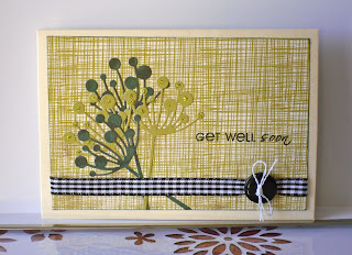
The challenge at Outlaws Sunday CAS group for 10 March (my birthday as it happens) is to create a CAS card using dies.  Now, I do have a few dies (lol!) and love using them with stamps or on their own, so I have made my card with a Memory Box die called Chloe stem with paper by Authentique from their Free Bird series.  I just added the gingham ribbon and button and twine and inked the edges of the background paper - hope this is CAS enough!

CAS at Less is More

Image
This week's challenge at Less is More is to make a One Layer Card with Spots and Stripes.  I love the simplicity of this kind of challenge, which is a challenge in itself!  I am not confident with graphic type layouts, but I'm determined to test myself whenever I can, so using Gina K's Pretty Patterns clear stamp set (being clear helped enormously to line up images) I created this take on spots and stripes.  The memento inks used in the pattern were Paris Dusk (blue) and Teal Zeal.  Please leave a comment if you visit, as I would love to know your feedback

Go Green

Image
This weeks challenge at SweetnSassy Digi ( SNSDC  ) is to Go Green.  That could be to recycle something - which isn't too difficult, as we all are trying to re-use, recycle or reduce, aren't we?  Or alternatively, you could use the colour green.  To play safe, I have made two cards, the first of which is a CAS card, using scraps of green paper which I might have thrown away (I say might, because I hardly ever throw scraps away lol).  I punched out several 1.25" circles, inked the edges and arranged them on a strip, and then stitched the edges of the strip on my machine.  I adhered this strip to the side of the card, then added another circle, cut into a hoop, out of which is popping Bunny 1 from the  February Release Digi Set .  The sentiment is also from that set.  I attempted a little more recycling on this second card, which again uses images from the   February Release Digi Set .  I cut the clouds out of a cardboard ta...

Embossing and stamping

Image
Today's card features embossing, with stamping of course!   Sweet Stamping Challenge blog   has set this feature of card making as their challenge this week, and as embossing - of both kinds - is a regular go-to for making cards, I wanted to participate.  For this card I used a sketch from last year (I save most of them!) by My Favourite Things.  The dry embossing on the rectangle mount is a folder called vintage flowers by Crafts-Too, and the flower pot is embossed with a cuttlebug folder called Herringbone.  Both were sponged with Scattered Straw DI, the stamped image is by Gina K:  Buds and Vases, illustrated by Melanie Muenchinger and I coloured them with Copics, mixing a few colours in an attempt to match the dp strips and flag.  I stamped an extra flower to pop up when finished.  The soft banana colour of the dp adhered to the card base is from a paper stack I picked up at a department store and I really love how it complements the rhu...

Colour Challenge at LIM #2

Image
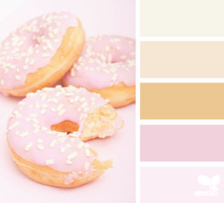
The challenge at Less is More   this week is a colour challenge, inspired by this yummy image! I have created a second card for this challenge - a scene which reminds me of a weak sun shining over snow.  Well, not exactly, but it does have that element of wistful silence, and that is the reason I chose the sentiment by Gina K - also the birds.  The twiggy tree is a die by Memory Box.  Thank you for visiting today!

Colour Challenge at Less is More

Image
A quick post today as I have two cards to enter into the Less is More challenge this week.  This photo was the inspiration to use the colours which I have named:  ivory, biscuit, caramel, pink and pale pink.  The unusual thing about my card is that I woke up this morning visualising what I was going to do - and I can honestly say that rarely, if ever, happens!  The image I had in mind was of bubbles bubbling over, but I had no idea how to create the bubbles.  Then I found a flourish stamp by Candi Stamps, promoted by a recent magazine - I was in business!  I stamped the 'bubbles' with Brilliance Copper to emulate the caramel colour about 4 times along the bottom, the last time masking below so that I could have one bubble above the rest, and clear embossed them.   Same thing with the sentiment.  I then coloured the circles with Spun Sugar Distress marker, and diluted some of them with an aqua pen to arrive at the two shades of pink.  The...

Feminine card

Image
I think we all find feminine cards some of the easiest to make - we love using pretty papers and designs and let's face it, most of our cards are given to females.  So when the Sweet n' Sassy Digi Challenge  this week is all things girly - a feminine card - we probably all said 'Yay!'.  I have a birthday card for a friend to give to a mutual friend, and because I know the recipient, it was even easier to create this card. Thinking about what appeals to women, I thought of flowers, ribbons, lace and bows.  I think I managed to get them all in here (I know, I left out chocolates, but I think I must be one of the few women who don't particularly like chocolate!).  The digi stamp is Coneflowers by SNS, and after colouring it with Copics, I cut it out with a Spellbinders Floral Oval.  I adhered the band of scallop edge, lace and ribbon to the dp from my stash, then stitched the flag onto the dp, and stitched that all to the green matt.  I creat...