Posts

Showing posts from 2014

Family

Image
Hi everyone, I'm back from a short cruise in the Pacific Islands, feeling relaxed and ready for the hectic activity that always surrounds Christmas.  The theme this week at Less is More is Family  which is just perfect for Christmas, when families try to spend this happy time together. My card uses a beautiful digi image by A Day for Daisies, called Sisters at the Beach.  I added the clouds by IO and the scrabble tiles are by Bo Bunny. I had to add this photo below, because it is so special to us - being of our youngest grandchildren, playing in the water near their home in Brisbane during a week when we had been looking after them while their parents were away.  There is only 14 months between them, and they are such good friends, even now (at 7 and 8).  It was quite a deserted spot, so no problem for the nude beachgoer!  You can see how the image of my card appealed - family is our greatest joy!

Congratulations Graduate

Image
My card today is for a young man, son of our neighbour, who will graduate medicine on Friday.  Just thinking about the hours of study he has put in to reach this goal is daunting, but knowing what a thoroughly decent young man he his, we are so delighted for him.  He will begin his career at a top hospital in Melbourne, and we look forward to following his career.  Well done, John - you are ACE! I have used a die by QuicKutz for the heart beat line (not much use for this except for Valentines Day, so I was thrilled to think of another use for it!), some stitched hearts by Lil'Inker, and a sentiment by Inspired by Stamping.  The red strips are a line stamp by SSS.

Celebrations at Less is More!

Image
Congratulations to Less is More this week, on reaching their 200th Challenge!  What a great challenge site this is!  The always friendly, encouraging comments from Chrissie and her DTs are so appreciated. To celebrate this milestone, well, the theme is Celebrations, naturally lol!  I am entering a card I will be presenting tomorrow, to a dear friend, husband of my card-maker mentor, so although I don't mention or use the word 'celebrations' on the front of my card, I hope it qualifies.  An 80th birthday is certainly worth celebrating! I love this colour combination for male cards, making a similar card to this for my grandson earlier this month, as he turned 17.  The stars were cut using framelit dies by Stampin' Up!, as well as a die by Sweet'nSassy for the outline star and I have assembled them using the inlaid die technique that I have seen on Pinterest lately.  A real test for my spatially-challenged brain, but so worth the effort, I feel.  ...

The Red Nose Roo

Image
Christmas is on its way, as I'm sure we are all too well aware, so no surprise that the challenge this week at Less is More is Jingle all the Way.  I don't have any bells (though I've been lusting after some dies I have seen!) but I do have some humorous digi stamps by Make it Crafty, with an Aussie flavour, which I decided to use, rather than the more traditional images.  As usual, I have not checked out the entries yet, so have no idea if anyone else has gone down this road, but here they are.  Now, I have never actually seen an Australian Christmas tree like this, but knowing the Aussie sense of humour, and love of beer, it is quite possible! My second image is called 'The Red Nose Roo', and isn't she cute, with her little joey joining in the Christmas fun.  The MFT snow drift dies have morphed into sand hills for this card and I decided to keep the rest of the background simple, as I thought the first card might be a bit 'busy'.  For th...

Christmas Wreath

Image
Hi there!  Today's card is for Scrapbook Boutique November challenge where the inspiration photo is decidedly Christmasy!  I have been wanting to create a wreath of my own for some time, but never seemed to choose the best foliage to use for this technique.  This time I used a small holly twig from a Bo Bunny set that came with a craft magazine, which I originally chose to buy because the Father Christmas image was divine.  I was delighted when I noticed that little sprig, because it was just what I needed for this wreath.  I used two green inks by Memento - Bamboo Sprouts and Cottage Ivy, added some red berries, and a few wispy strands of foliage found in a SSS set along with the little star shapes to mimic the scattered balls in the photo.  A bow from another SSS set, a Happy die and the text Christmas from Stampin' Up! and all of this mounted on stitched squares by Lil' Inker and adhered to a Kaisercraft square card.  This was fairly quick to pro...

Addicted to CAS has turned 2!!

Image
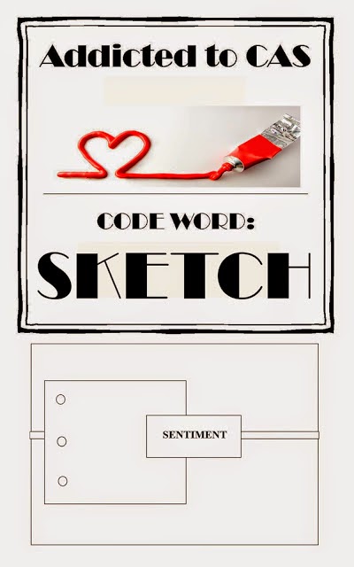
Congratulations to ATCAS who turns 2 this week, with their 52nd challenge being a sketch. I have simply used a nativity scene die by Precision Cutting Dies bought from Frantic Stamper Inc and kept pretty much to the sketch.  The stitched square is by Lil' Inker and the sentiment from Annabelle Stamps. On a personal note, I am privileged to be helping to celebrate the 90th birthday of a dear friend and member of our Probus Garden Club.  Heather has a wealth of knowledge about plants and flowers, which she often shares with us all, and we are meeting at my place tomorrow for a little garden party morning tea for her. I made this banner for her by stencilling letters onto stitched calico flags, and added felt flowers and butterflies and printed a couple of botanical posters.  Heather loves pretty colours, and so I made these rose pots from cardstock, using the Stampin' Up rolled rose die, to decorate the tables.  They were pretty quick to make once I got...

LIM challenge #198

Image
We had a wonderful visit to our daughter in the States, recently, but it is also lovely to be home!  One of my first tasks was to put away lots of 'stuff' I brought home with me, and the next thing I did was re-organise my stamps and dies, following Jennifer McGuire's tips on Youtube - you can find one of her many posts on this subject here .  I am so happy with the progress I am making, and the resulting ease in finding just what I'm looking for so easily.  I urge anyone who has ever felt overwhelmed by their supplies, and the wasted time it takes to search for that special image you know you have but can't quite find, to check out Jennifer's ideas!  You won't be disappointed.  FYI I am using the Avery Elle pockets and find them excellent. After all that organisation, I couldn't wait to get back into crafty business,  and set about entering the   LIM challenge this week.  The theme there is:  more than one tree - how lovely!  One of ...

Christmas Wishes

Image
This week it is a one-layer challenge at Less is More with the criteria TWO.  There were some beautiful examples by the DTs as usual, but I didn't have much time to search for that special image I thought was needed.  Instead, I chose to do a stencil image, and here is my card. I saw Jennifer McGuire demonstrate this technique on youtube - do check it out here as her result is stunning!  Sadly, I don't own a stencil as interesting as hers, so I used the chevron one I did have, made a star stencil from a punch, and stamped the sentiment by Stampin Up! and the snow flakes from Gorgeous Grunge.  I am thinking now that I should have added decorations, but my first thought was that they are in the snow, so who would be decorating trees out there?  Goodness knows why I thought I had to be realistic - this is card-making isn't it :)  This is a great technique, however, and well worth trying with various shapes. I have been alerted to the current challeng...

Scrapbook Boutique October Challenge

Image
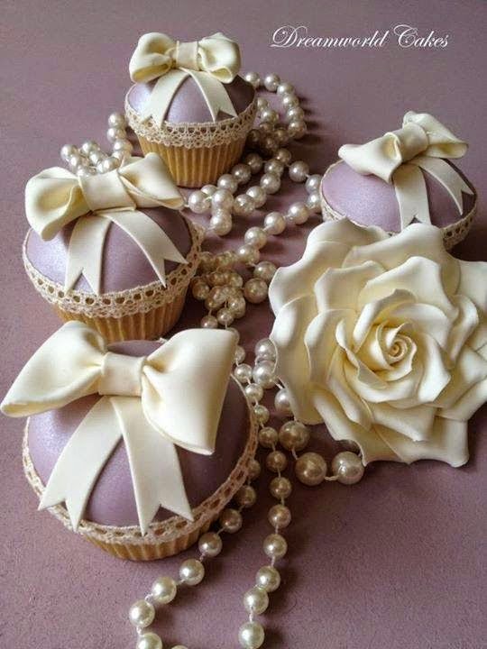
This is the inspiration photo for this month's challenge at Scrapbook Boutique :  I was inspired by the elegance of this picture, the soft colours, the pearls and the bow - a lot! For my image, I white embossed this fanciful flower by Woodware, sponged the background in pinks and mauves, added the pearls and bow.  The sentiment from the same set is stamped in Memento Paris Dusk. I wasn't sure I would be able to enter this month, as I really should be packing for our visit to our daughter in the States, but I just knew what I wanted to do and it came together quickly last night.  I'll be back in a few weeks, so will catch up with what I'm missing then.  Cheers, Ann

Autumn Bounty

Image
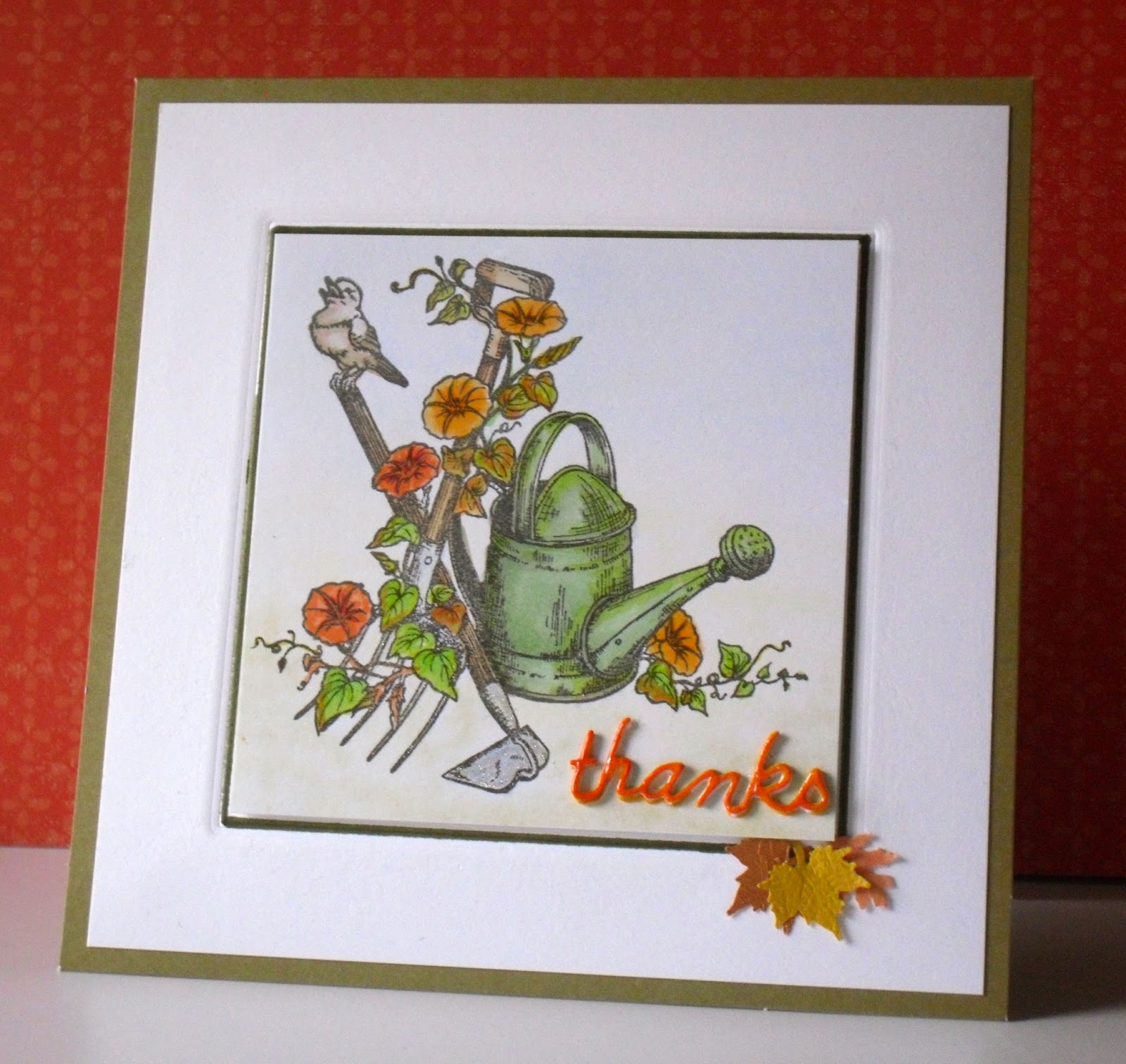
The colour challenge at Less is More this week, challenge #192, comes from the title Autumn's Bounty. I would think almost everyone would love the colours of autumn, or Fall, and all associated with it, and I am no exception.  Gardeners especially love harvesting the fruits of their labour, gathering up the glut of vegetables, and putting them to good use, either immediately or laying them down in some form for later in the year.  My card is a tribute to all gardeners, many of them in our own family, but sadly I don't  where this lovely stamp originates from as I stamped it at a friend's house.  I do know it is not a digi stamp though. Just a simple card, with the image coloured in Copics, the background hint of colour with chalk, and some punched leaves to add to the sentiment.  I did emboss the square die, but then almost obliterated my efforts by lifting up the image on foam tape!  The little 'thanks' is by Memory Box and is cut three times...

Words, words and more words ...

Image
I don't know what it is about the latest challenge # 191 at Less is More  this week, but each morning I have woken with a new idea in my head.  I will, however, only be entering this first card, but I had fun trying to make my ideas work.  I failed miserably with my final idea this morning, which was to use my Portrait (very new and I have no idea of graphics!!) to create a design which resembled the iPhone app called Word Storm.  I did manage to create an octagon, then a border around it, and then the 8 sections, but when I added the small octagon in the centre, I realised I still did not know how to remove the crossed lines in the centre shape.  Oh dear, back to the drawing board, or to the internet to search for lessons, but I had fun trying to solve my problems.  If anyone reading this could point me in the right direction for good lessons, I would be most grateful. Now to my actual entry - this is a little 'Itty Bitty' by Unity Stamps Co - heat embos...

Happy Dance

Image
This week over at the  Less is More challenge #190  the theme is 'face the music and dance' - a choice to please many!  Without further ado or unnecessary chit-chat (because I'm short of time lol) here is my card. The image is a digi by Bugaboo, called AKV (a kid's view) Trio of ballet dancers - coloured with a few copics, a computer-generated sentiment, and the Simon Says Stamp 'happy' - oh, and some washi tape for the side panels, and a sprinkle of SU candy dots.  Those three little girls sure are having a 'happy' dance!  Wishing everyone a happy week!

September Challenge at Scrapbook Boutique

Image
On the 10th of each month, Scrapbook Boutique opens a new challenge - and each time it is an inspiration picture.  This month it is no different - another yummy cup cake inspiration! I was taken firstly by the colour combination, of red, white and aqua - then I focussed on the circle and  'dots' - around the circle topper, and on the cupcake wrapper.  So there you have it - circles and dots, and red and aqua - with a little richness of brown thrown in, as per the photo! I have used the fox from the Stampin' Up! set Life's Adventure - he's only small but he packs a punch!  I cut the sentiment from the rubber stamp, to make it easier to stamp onto the banner by WPlus9, cut the circle with a stitched circle die by Lil' Inker, and mounted it on a tag and then onto the aqua strip dry embossed with SU large dots. I will link this card to the Scrapbook Boutique challenge, and also to  Addicted to CAS , where the theme word for Challenge #48 is 'Cuddl...

Tea time, or time for tea

Image
This week's challenge at Less is More is a one-layer card, with the theme of Beverage.  Like most adults, I enjoy a glass of wine at dinner time, but I've often thought that if push came to shove, I would find it more difficult to give up drinking tea, than I would wine!  With this in mind, I have chosen to feature tea as my beverage for this challenge, and am using images from the set, TEArrific, by Janes's Doodles.  This is a new company to me, but in my two orders with Jane, I have found her to offer extremely good service.  I look forward to finding more goodies at her site in the future. I must also say I am indebted to Chrissie for her tip on how to print a sentiment in a desired position - it worked for me!  You can find her tip here .  I am running an old version of Word, and found I had to make the zoom at 145% but the method was the same. As I am using brand new 'schtuff', I will enter this card into Darnell's challenge to use 'never-before...

Gorgeous Sunshine

Image
Sunday here today and it's a beautiful sunny day, just at the end of winter.  And over at  Less is More Challenge #187   this 5th week of the month is a lucky dip, this time with the theme of 'I do like to be beside the seaside'.  How fun!  I have chosen a gorgeous little digi stamp which I first saw on Iwona's blog, created by her friend  Elena .  It was a freebie, but I'm not sure if it still is - but please take a look as it is just lovely!  I have probably made my card over-simple, but I focussed on the colour and that cute image for this challenge.  I intend to make another card with it, but this time for my great-niece Emma, so it will have a lot more 'bits and pieces' to it.  I may post that one later.

Sketch challenge at Less is More

Image
This week it is not your usual challenge at Less is More because it is a sketch - great for me!  I do enjoy working to a sketch though choosing the right image is still difficult.  However, I am very partial to these gorgeous beach boxes, which came in a set by Crafty Individuals, made in the UK I believe.  We have these beach boxes all along the shore of Port Phillip Bay, which is where I live, and I love them!  Some are looking a bit shabby, and our local council has decreed that when they fall into dilapidation, they can't be replaced - progress?  I don't think so, so while they still exist, let's enjoy them, I say!  We don't own one, unfortunately, but a couple of years ago, did spend a magic New Years Eve as guests of a friend of a friend, who let us shelter from the sun, and enjoy delicious BBQ food at his charming beach hut.  In the late afternoon, the temperature was over 40C, the sand was too hot to walk on, but it was stunning to...

ATCAS #45 - Geometrics

Image
I had a little time today to look around other blogs, and found this challenge at Addicted to CAS , where the theme word is Geometric. This is a card I made a little while ago, following a tutorial I saw on WPlus9.  It uses nail polish for the marbling effect, and is cut out using their Quilt cut die.  I immediately had to purchase that die, and love the effect, but I had not posted it till now.

LIM #185 - Animal

Image
Great challenge this week at Less is More - the theme is animal.  No other restrictions - it doesn't have to be a one layer either - Chrissie, you are too kind! So without further ado, here is my card: I have used a really lovely stamp by Penny Black, but one that I have only used once before.  I thought I could try watercolour again as there really isn't much to colour (phew!).  Once I had let it all dry, I decided to do a wash background.  You might not think that was a big decision on my part, but as I do have a tendency to mess things up, I often play safe and leave 'well enough alone' but this time I dived in, and like the result.  I thought the cheery sentiment from Paper Smooches was the best choice for this friendly card.

Foliage

Image
This week at Less is More   it is a One Layer Card challenge, with the theme of Foliage.  That is a lovely choice, no doubt influenced by the coming Autumn in the northern hemisphere, but a great choice for all seasons just the same.  However, my card does reflect autumn, a beautiful time of year in our neck of the woods (Victoria, Australia) with its more consistent weather, clear skies and yes, we do have autumn foliage here.  I was influenced in my choice for this card by the beautiful inspiration from the DTs, and used a homemade stencil for my leaves, stamped with Distress Ink - shabby shutters, scattered straw and spiced marmalade.  The stencil is the negative from a Memory Box die, and the sentiment is from Stampin' Up! Wetlands stamp set - an absolute favourite, though this is the first time I have used this sentiment.  Poor photography in the late afternoon has cast some shadow on my card, which looks more wobbly than it does in real life...

Just keep swimming!

Image
This is the title of my card today, for Less is More challenge #183 - it is a colour challenge, using some or most of these beautiful, summery citrus colours.  A beautiful colour palette, thanks so much Chrissie! Here is the card I decided to make, using a digital image by The Alley Way Stamps - I think it was a freebie, too, which makes it such a pleasure to use.  I first acquired it, when I needed a 'swimming' theme to make cards for my little grand-daughters, as they had achieved excellent results in their first swimming meet in Wisconsin.  Little fishies, they are, and so I wished them 'best fishes' and said their efforts were fintastic - as you do lol! But I figured this image could also convey support to someone struggling with life, when there is no other option, than to 'keep swimming', or go with the flow.  I did manage to lassoo the sentiment, which was in amongst the fish, and dropped another little fish into its place, so I hope that has...

LIM #182

Image
This week, in celebration of Chrissie's birthday - very best wishes, Chrissie! - the challenge at Less is More is Anything Goes!  Woo hoo! This post includes my latest play with the cute animals from Mama Elephant's stamp set, Up Up and Away.  A gorgeous set, but a new one for me.  Here is my card for this week.  I first coloured the branch and flowers with DI through a stencil - I like how this looks.  I then bravely (because the card was almost finished) used the little dash lines from the set to mark out the border for my sentiment, phew - that looks OK, but then I may have gone a tad too far, with the sketchy blue sky, using a Copic marker - B00, blended with the colourless blender pen.  I do like the contrast of the blue, but I need to practise that technique. As I said, this is a new stamp set for me, and my first card - seen below - just didn't seem right without some colour beneath the image, so I couldn't really enter it into the...

Art Impressions challenge #140

Image
Big Birthdays! is the title of the challenge at Art Impressions this week.  I have recently acquired a few of these fun stamp sets, so am entering one of my latest creations - I usually have the candles or a cake on the card as well, but this time I'm leaving it up to your imagination - I hope it still works.

Case Study Challenge #199

Image
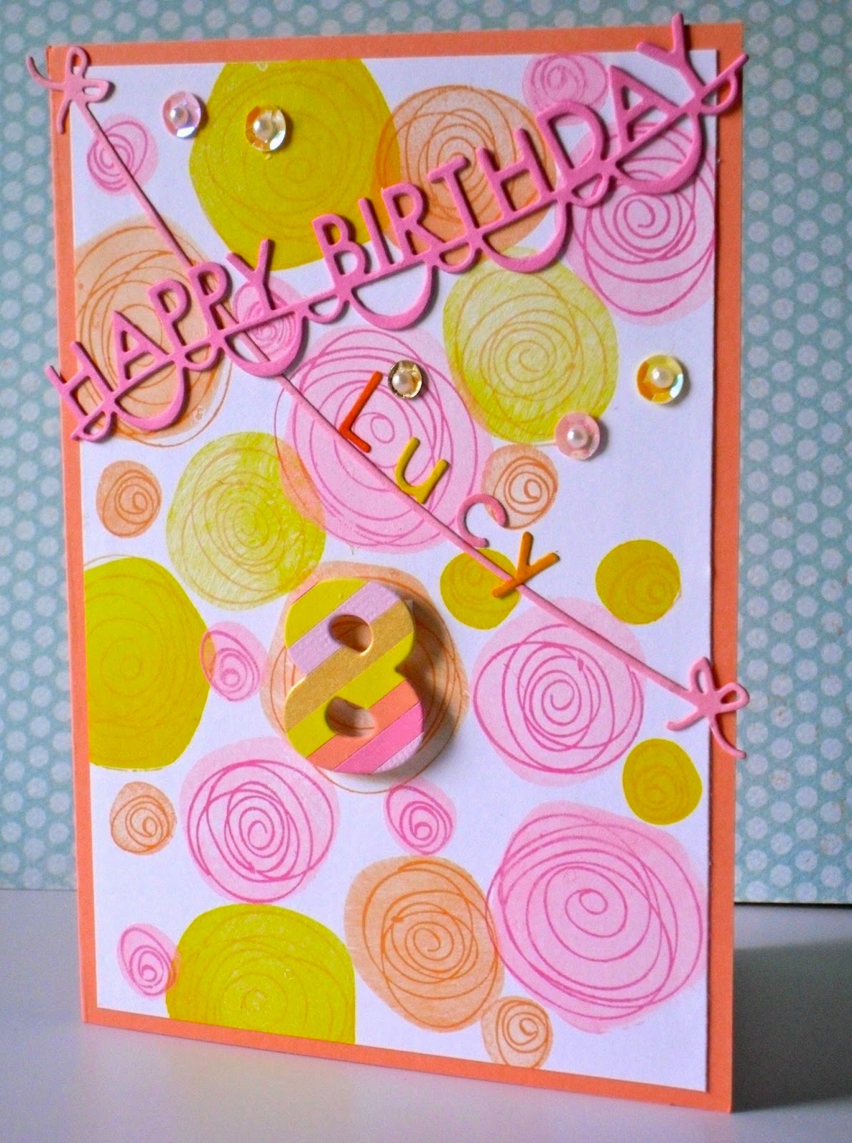
Wow, I don't know what I'm thinking of, but here am I entering my humble card into one of the most respected challenges out there!   Case Study Challenge includes designers at the forefront of this business working to inspire us! I admire the work of every one involved with this challenge, and was inspired by the muse card, so just went for it. This card has been made for my grand-daughter, who, upon opening a card I had once made for her (I think it was her birthday last year, when I was there to see it being opened - not that I only make for her birthday lol) - said to her younger sister,  'look at all the detail she has put into it!' Bless!  So this card has details, even though I think it is still a clean card, though there isn't much white space. Inspired by the circles of Shari's muse card, and trying for a stamped version similar to her current inspiration, I used a Simon Says stamp of the month set to create scribbled circles in various sizes.  I...

Earth Tones

Image
My card today has been created using earth tones, which fortunately is the recipe for this week's challenge at Less is More - Challenge 179.  Our grandson has just returned from his school's camp to Central Australia, and in helping him collate his photo album, the colours of our 'red centre' have been seared into my brain!  Anyone who has flown west over Australia will know that for hours and hours, all that can be seen from the plane is the red earth of our outback.  So my card pays homage to this hot country, with warm thoughts and warm hearts. The stamp is by Stamp-It (Perth), and the background used three warm colours of Distress Ink:  Scattered Straw, Spiced Marmalade and Ripe Persimmon on watercolour paper.  The sentiment is by Paper Smooches.

Sweet n' Sassy Friday Challenge

Image
Another quick post today because I have just come across a challenge at SnS which is all about animals!  I love to make cards with animals in them, and have just completed several baby cards featuring elephants, but more of that later.  The card I am choosing for this challenge uses a gorgeous stamp by Stampendous called Spring Chick!  I coloured her brightly, mounted the image on aqua cardstock, then onto a yellow card covered with the hexagon hive die cut by Stampin' Up.  I added a frangipani bloom because I wanted to ground the bright yellow.  No sentiment on the front because this card could say anything you wanted it to.

Watercolour vase

Image
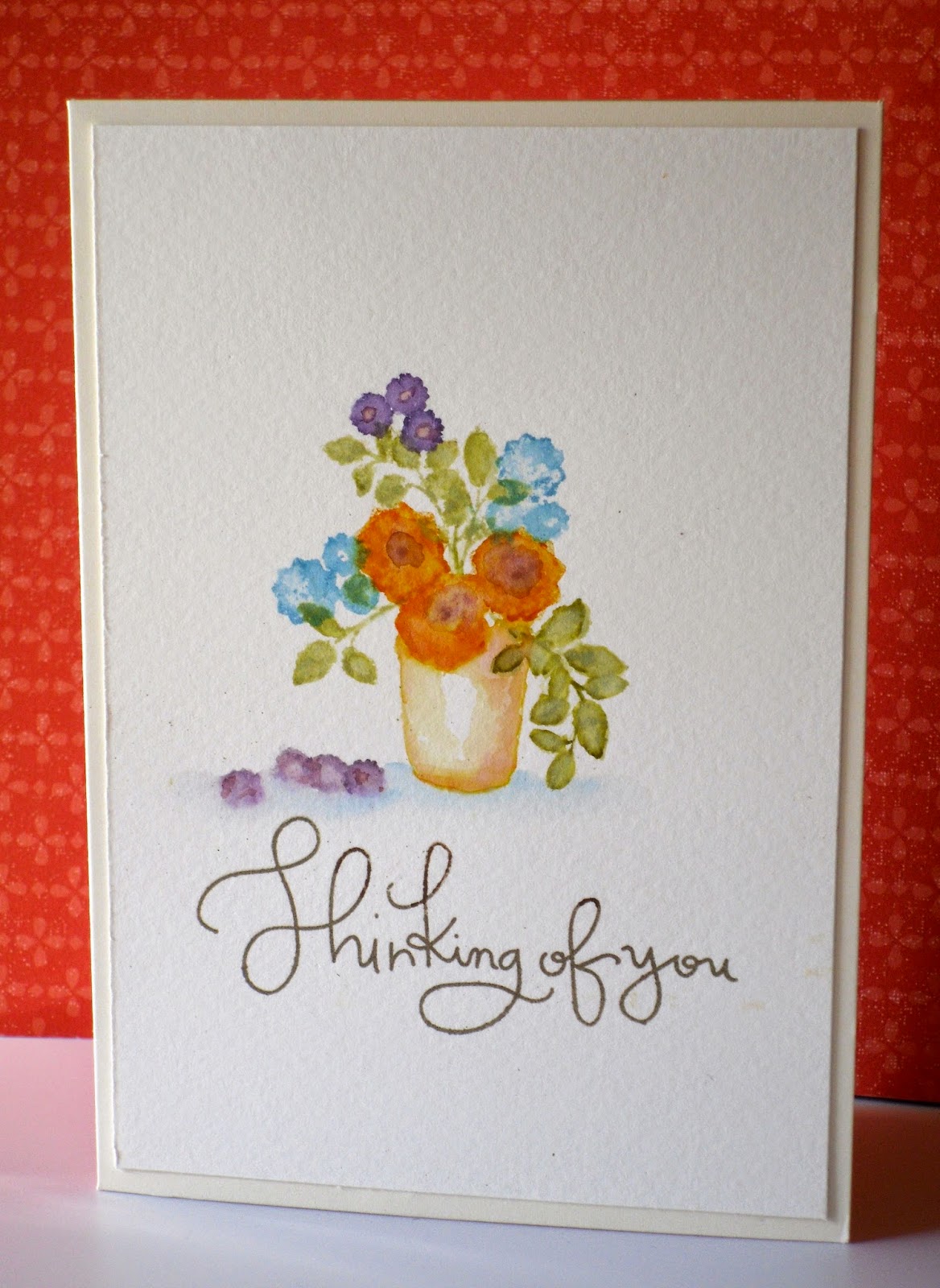
Watercolour techniques are everywhere at the moment, and I am loving them!  As a total novice at anything 'arty', I love that the supplies needed are not expensive and in fact you can use inks etc that you might already have.  Just buy some true watercolour paper, and some sort of brush or aqua painter, and you can start to create some amazing effects  The challenge at Less is More this week is just that - use water to move your colour - so I am entering a card I have made - my very first watercolour card - which I created following a tutorial by Dawn Wolesagle from WPlus9.  I didn't have the stamps she used, but I did have another WPlus9 stamp set, called Folk Art Florals, so I had a 'go'.  I love the result, but of course, need to practise a lot more!  I'm showing it here, just to be part of this challenge.   I used Distress markers for the colour, just scribbling them onto an acrylic block and spritzing with water to dilute.  T...

Less is More #176

Image
This week's challenge at Less is More , is a one-layer card, with the prompt:  off the edge.  As is my usual method of participating in a challenge, I haven't yet looked at any other entries, but I have had plenty of ideas myself, but most of them require another panel of cardstock!  I'm sure if I thought harder I could adapt my ideas, but I have a sore leg (what a baby!) and I don't think I'm feeling as on top of things as I should be.  One of the 10 BCCs (skin cancer) I had cut out 5 weeks ago still hasn't healed, and is now more painful than when it was first 'done'.  Lower legs are notoriously difficult to heal, I believe, but I'm back to keeping my leg up and now taking anti-biotics, so will be on the mend soon, I hope.  You really didn't need to know all that, of course, so here is my card: I have used images and sentiment from Stampin' Up's Peaceful Petals stamp set, coloured with Copics.  I quite like the design, so am happy ...

LIM #175 - colours of my bedroom

Image
The great idea for the colour challenge at Less is More this week is to choose the colours of your bedroom.  I would expect that if you choose the colours of your bedroom yourself, then they must be colours you like!  My husband was just saying today that purple (and yellow, but we'll leave that part out) were always his favourite colours.  Luckily then, that we have 'aubergine' and predominantly white in our bedroom, with a little dash of other colour such as pink, lime, orange.  And maybe that is why my latest card has just those colours in it, so perfect for this challenge.  My card today has been a bit of an experimentation, using stencils, both bought and home made, and a couple of Memory Box dies - I love their daintiness.  But you can see that this card echos the colours in my bedroom.  I do apologise for the terrible photo of it, but it is impossible to take a better shot, as I'm looking into a wall of windows!  Our bed linen...

Less is More Lucky Dip

Image
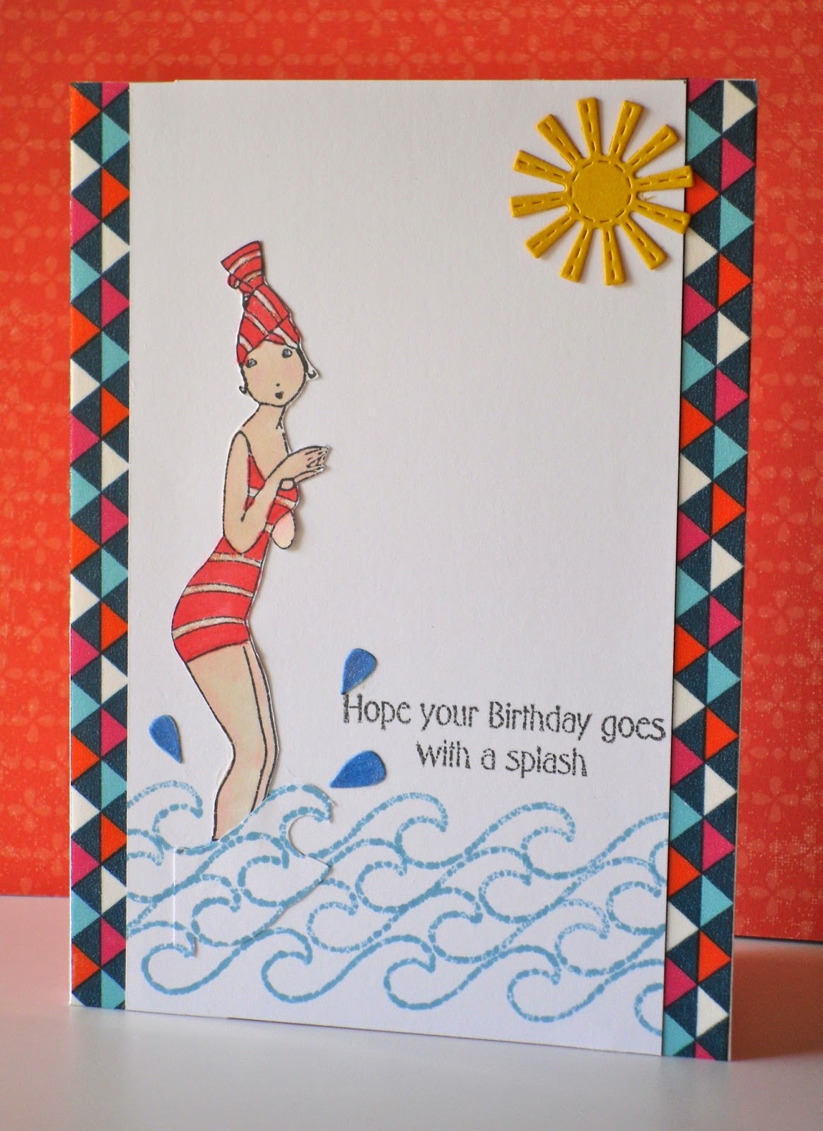
If you are like me, then you love stamping more than anything else when making a card!  I certainly love my dies, paper, and embellishments, but if there is little or no stamping on my card, I feel a bit of a fraud!  Well, if you feel like me, then this week at Less is More, is just for you.  Challenge 174 is a lucky dip, and it is to use more than one stamp. Here are my entries - yes, both of them! My first was created with a stamp by Acid Drops and Whatnots, which was a free gift in the Australian magazine, Simply Papercraft, and I used the sentiment from the same set.   I teamed this fun image with the wave stamp which is by Stamps of Life, and was part of last month's Stamp of the Month.  For the splashes, I used raindrop dies by Sweet 'n Sassy, a stitched sun die cut by Lil' Inker, and some washi tape for the side panels. For this more traditional card, I used a lovely flower from the Gina K set, A Year of Flowers, and the sentiment is by Stampin...

Less is More #172

Image
The challenge this week at   Less is More has the theme - flowers!  How lovely!  My entry is my effort following a video tutorial by the very talented Therese for Scrapbook boutique.  You can check it out h ere .   In the tutorial, Therese used the beautiful Delicata gold ink for her flower, but in the absence of that particular ink (it would be awesome to own everything wouldn't it???) I used my little tear drop by Brilliance in Galaxy gold, quickly sprinkling clear embossing powder all over the die cut by Memory Box (Peony) as it is a quick-drying pigment ink, and heat embossed it.  In real life, it gives a beautiful textured finish which is very pleasing.  I scribbled and blended the colour from a few Distress markers for the bloom and single leaf outline and adhered the die cut over these.  The sentiment by Paper Smooches is also heat embossed in the same gold ink.  I mounted my water colour panel over a mint-coloured card, after wrappin...

Autumn Leaves

Image
My card today has been made for the May challenge at Scrapbook Boutique , inspired by this photo: Those delicious chocolatey swirls were the starting point for me, plus the autumn colours of the leaves. Having seen Jennifer McGuire using the Radio Waves stencil by Memory Box to make this card, I immediately thought of this stencil to mimic that shiny swirly pattern!  Firstly, I clear embossed through the stencil, then stamped and embossed leaves from the Gina K designs set 'Sunkissed Autumn' in the colours from the photo, finally adding a white embossed sentiment by Paper Smooches.  The buttercup hearts are from Simon Says Stamp.  A strip of russet dp separates the two different textures of the card and picks up the colour of the cake bases.